One year ago today. I was getting ready to welcome people to my opening.
Read MoreSome very special people who attended my opening.

Some very special people who attended my opening.
One year ago today. I was getting ready to welcome people to my opening.
Read More
Shop local. A budget is a moral document. Build community.
These are all things I believe in. Which is why I took some time deciding whether or not to be a part of Needham Bank’s new ad campaign “For the Life You Build”. The folks at the bank understood my hesitation and spoke with me at length about their commitment to DEI and the CRA.
Diversity, Equity and Inclusion are goals for all of us. The Community Reinvestment Act (part of the Civil Rights Act) has mechanisms for grading banks on fair lending practices, accessibility to underserved communities and other criteria. Needham Bank has made strides. The people I spoke to are thoughtful and committed to the kind of change I am hoping to see. I really think small banks are a great place to start.
You can look up your bank’s rating here.
For the television ad, click here. Don’t blink or you’ll miss me!

When I started work on this piece in the summer of 2018, I asked the question 'How did I end up living and working in mostly white environments?'. It had never been my goal. One answer is that the path of least resistance for a white person leads to a segregated life and to the invisibility of racism within that life. Another answer is that racist financial and governmental policies designed to benefit white people created this situation. Both are true.
The back walls my installation are made of brightly colored, hand dyed, cotton batting. I dyed and stitched the Redline map of the Greater Boston area to use as the outer walls of the installation The original Redline maps were created as part of the New Deal, and they were used by insurance companies and banks to prevent black people and other marginalized groups from receiving mortgages or buying property in white majority neighborhoods. I used cotton batting to recreate the maps because that material is usually reserved for the inside of quilts; and quilts are often designed to tell stories. The true story about white prosperity is that it is built upon the unseen and unfairly compensated labor of black and brown people, and the biased promotion and protection of white people. The white paper cutouts show houses and college pennants, two of the tools for improving an individual's or a group's wealth and well being. These opportunities are much more available to white people than to other groups.
For more information about redlining, visit the Mapping Inequalitywebsite.
With deep gratitude to Matt Kedzierski, Sand T, and Alice Rufo for helping me to install the piece. For more information about this artwork, scroll to my previous post and read my artist’s statement.
Red Lining and Blind Stitching in the Fabric of Greater Boston
An Installation by Caroline Rufo
“Intervisible” is a term used in urban planning. It refers to the state of being mutually visible from specific positions in the landscape.
The history of the development of suburbs around American cities is the history of how racial segregation was maintained after the Civil War and during the Great Migration. It is the story of how the financial and municipal resources of the 20th century were purposely directed to white people and away from people of color.
The fabric, paper, thread and string used to make up this artwork are all 100% cotton.
This history remains invisible to many white people. It takes effort to see and believe the way white suburban prosperity and black urban neighborhood degradation was caused by a combination of real estate practices such as “blockbusting”, racial covenants designed to keep people of color out of white neighborhoods, the redirecting of government resources out of the cities and into the suburbs, and of redlining.
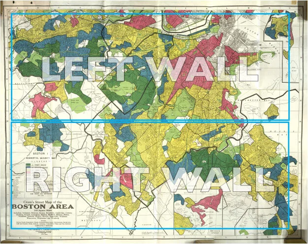
The design of the outer fabric walls of this piece are taken from the Home Owners’ Loan Corporation “Redline” map of Greater Boston. These walls are made from hand-dyed cotton batting, a fabric usually used to line the inside of quilts.
This piece explores the ways I am encouraged as a married suburban cis-hetro-white woman to direct my gaze on my home, the town where I live, the rearing and education of my children, and my “personal growth”; rather than on the structures that maintain our system of white supremacy. Complacency results in blindness and continued injustice. It leads to the dangerous myth of the “self-made man”, which can only exist inside a vacuum of white historical mythology. It leads us away from true intervisibility.
The inner walls of this piece are designed to interrupt the viewer’s ability to see the maps. The images cut into these screens include, cotton plants, college pennants, Battenberg lace, chain link fence, and houses.
I would like to acknowledge that all of the land referred to in this artwork, as well as the land where this gallery stands, is the traditional hunting grounds, fishing grounds and home of the Massachusett peoples.
And, I would like to note that the land did not consent to becoming an instrument of oppression.

Above is an image of the HOLC redline map of Boston. In the installation, I translated the two boxed areas into fabric walls.
Below are process images. Left to right, top to bottom: Detail of a model of the Installation, sample of cotton Battenberg Lace, pieces of hand dyed cotton batting being reassembled into the map walls, one panel of laser cut watercolor paper over the stitched fabric map, an image from a day of research at Lowell Mills, Drawing of a cotton plant, cotton samples from the RISD Nature Lab, Hand dyed fabric for the maps drying, sketch of the gallery space, hanging lace panels, process shots from a photo shoot of some elements of the installation. (Thank you to Matt Kedzierski for support and labor on this project!)

Intervisible
Red Lining and Blind Stitching
in the Fabric of Greater Boston
March 3 - 29, Bromfield Gallery, 450 Harrison Ave. Boston
Opening Reception March 6, 6:00 - 8:30
*Intervisible (from urban planning) is the state of being mutually visible from specific positions in the landscape.
Intervisible - An installation about structural racism and the culture that discourages us from seeing it.
Can we create more intervisibility in our neighborhoods, homes and schools?
Where we work and where we play?
Materials and Motifs:
The artwork consists of two 8 foot tall fabric reproductions of the *red line map of Boston and environs from 1934. Each of the two walls shows a different part of the map. The maps are a physical artifact, and indeed proof of the history of structural racism in America’s financial and real estate markets throughout the 20th century. They are made from hand dyed cotton batting, a fabric that is usually used inside of quilts, and red cotton thread.
Inside the room, laser-cut paper walls divide the space and allow partial views of the map through decorative obstructions. The laser-cut paper includes motifs of Battenberg Lace, chain link fence, cotton plants, college pennants, and houses.
Background:
Redlining is a process by which banks and other institutions refuse to offer mortgages or offer worse rates to customers in certain neighborhoods based on their racial and ethnic composition. In the 1930’s, HOLC (Home Owners’ Loan Corporation) was established as part of the New Deal.
HOLC map of Boston, MA
The maps made by HOLC were color-coded with the “least desirable” areas designated in red. In the 20th century, these maps were used (alongside restrictive covenants) throughout the US, to keep immigrants, and African American migrants within the United States from purchasing property in white dominant communities. Throughout the great migration and in the decades after, these practices were legal, until the Fair Housing Act was passed. Long after the act was passed, protections were unenforced. For more information about red lining, the website Mapping Inequality is an excellent resource. A recent article about the continued impacts of red lining can be found here.
Bromfield Gallery is open Wednesday through Sunday from 12pm to 5pm.
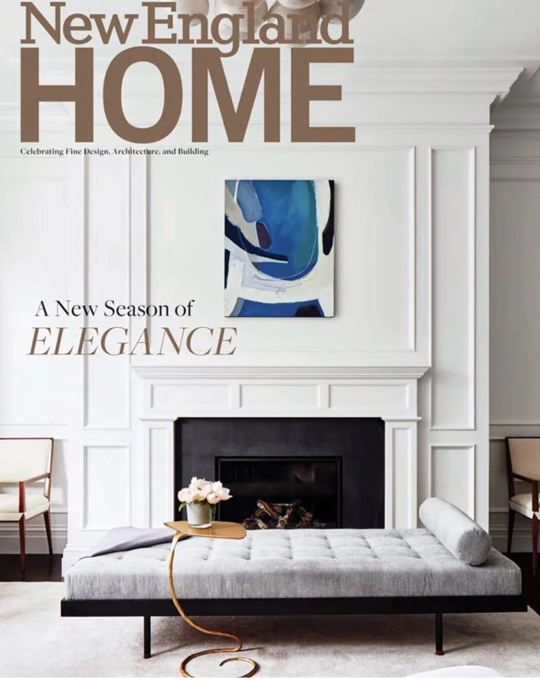
I was so pleased and excited to see my painting featured on the cover of New England Home Magazine! With gratitude to the Powers Gallery for putting my work in front of designer Lisa Tharp! Photography by Read McKendree.

My work on the Chapman House in Needham continues. The installation I am planning is beginning to take shape. I still have to work out a venue and I’m still in search of an historian to give me critical feedback. If you know someone who might be interested in working with me on the project (from a history/content standpoint), please reach out to me directly at:
caroline@rufoart.net
And thanks!
Laser-cutting watercolor paper for Green Book Art Installation.

Caroline is exhibiting some of her abstract paintings at the Powers Gallery in '“The Essence of Abstraction”.
Read More
I had never heard of “The Green Book” until this summer when I was doing some research in the Needham Public Library. I was looking for a hook for my next body of artwork. I knew I wanted to work with local history.
Read More
"A Woman's Place" A feminist artist's statement.
Read More
"The Discovery of Calculus" Oil and acrylic on paper, 14"x17".
When I made this, I was thinking about ideas, and how they break through into our thoughts. Also I was thinking about Math, and other ways of organizing ideas. They change the way we encounter the world. They can encourage or bully our way of thinking.

September 20, 6:00 - 8:00 at the VETS Gallery, Providence, RI. Sponsored by the Art League of Rhode Island.

"Diplomacy", 30" x 40", oil on canvas. © Caroline Rufo
Happy Independence Day! Hope you all have a great weekend!
Home, 36" x 48", oil on canvas. © Caroline Rufo 2016
While I continue work on the "Reading" paintings, some other things have been happening in the studio.
Read More
Beyond Personal Truth 36"x36" © Caroline Rufo
Most recent of the "Reading" paintings. A meditation on a relationship I'm hoping to strengthen.

Oil on Canvas, 36"x36". In my most recent abstract paintings, I always begin by asking a question. It can be a big philosophical thought, or a very mundane issue about the daily grind. My mind meanders over the question and I look at the small paintings I picked at random for this piece. (see some of the small images in the Chance Operations section of our website) Then I try to work out how these seemingly unrelated images might come together in a composition. Simultaneously, I try to reach widely to ideas around the edges of the question in hopes of finding a new solution. Eventually, the palette and shapes become their own response to the question. Plus, it really helps clear my mind.
As promised, I've begun putting the new paintings up on our website. I'm working with four very defined palettes and a visual language that I developed while working with dancers this winter. Click the link below to see 16 new paintings from this series.

At long last, I am reaching the end of this phase of my project. I've created 32 paintings this spring in response to the performance art collaboration of this winter. It has been a very long process, but the abstracts are beginning to emerge!! It was my intention to make 16 paintings, but it turned out I needed to make a horizontal as well as a vertical image for each concept, so there are 32. I'll be posting more images in the coming days and weeks.
Above "Down to Earth" 17" x 14" oil paint and mixed media on paper. © Caroline Rufo